Can you guys give me comments on my edited icons before I print out and mount it on a board? Thanks~
Thursday, January 31, 2008
last comment before print?
Can you guys give me comments on my edited icons before I print out and mount it on a board? Thanks~
Wednesday, January 30, 2008
Tuesday, January 29, 2008
I have problems with Adobe's new icons too.
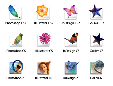
A good icon to me, besides communicating well to people, it should also have a distinctive design. Before the new adobe icons came out, the old one had a nice elegant design to it and shows the software would be just as exciting as the icons. As for the new adobe icons, to me, is just too simple. They are just two letters in a box, nothing exciting about it.
Thursday, January 24, 2008
Icon design first attempt
I created these little block icons. I like it... but unfortunately they don't fit to any theme.... so I will try to twist them a little bit and see what I can come out with.
Monday, January 21, 2008
search for more ideas

I just want to look into more icon designs and see how to create a unique and understandable icon. I found a book that is pretty interesting. "Pictograms, Icons & Signs: A Guide to Information Graphics (Paperback, 2006)" I couldn't find this book @ barnes&nobel or school library... thinking if I should buy it online.
An Article from the Web~ By:Iconshock Professional Icons
Icons are very important to the user-interface. People want to use an application's features to the maximum, and don't like to it when they can't find how to complete a specific task. This is why developers should always create shortcuts to the main tasks that can be accomplished using their application. These shortcut items must catch the user's attention, so adding icons will do the trick in most of the cases. The icons must be related to that certain task, so, for example, a disk icon would be a great visual enhancement for a "Save" button, as a printer icon would fit perfectly inside a "Print" button. A good set of icons in the interface will greatly improve the communication between the user and the application. Icons are colorful and, in most cases, larger than the description text of the application feature they relate to; this way, they are a lot easier to be spotted.
Most of today's applications use icons, even though pretty much all developers don't bother to implement custom designed icons into their applications. Actually, settling with the operating system's default stock icons is not such a bad thing as some people might think. Computer users might sometimes have some problems adapting to new applications, especially if they have different interfaces than the applications already installed on the users' computers. What happens if you want to save and you're looking for a disk icon, but you can't find it because the developer decided to use a star icon? If so, there will be a poor communication between the user and the application, because the interface's icons are different from the ones the user is used to. Application developers should not fall into this trap just because they like some other icons and they don't want to use the same old default system icons, because it would do more bad than good. The default system icons are preferred because most applications use them, so users will learn to use your application a lot faster. The functions and commands will be easier to understand, because users will be able to faster identify the iconic symbols.
Most of today's applications use icons, even though pretty much all developers don't bother to implement custom designed icons into their applications. Actually, settling with the operating system's default stock icons is not such a bad thing as some people might think. Computer users might sometimes have some problems adapting to new applications, especially if they have different interfaces than the applications already installed on the users' computers. What happens if you want to save and you're looking for a disk icon, but you can't find it because the developer decided to use a star icon? If so, there will be a poor communication between the user and the application, because the interface's icons are different from the ones the user is used to. Application developers should not fall into this trap just because they like some other icons and they don't want to use the same old default system icons, because it would do more bad than good. The default system icons are preferred because most applications use them, so users will learn to use your application a lot faster. The functions and commands will be easier to understand, because users will be able to faster identify the iconic symbols.
Tuesday, January 15, 2008

Wednesday, January 9, 2008
Project Icon
this assignment is hard!!>< the 1st word on the list already kill me.. i can't come up with any icon that represents "cheat" ......


Subscribe to:
Posts (Atom)
